Too Much Comfort for Comfort
 Yeah, yeah, I know the Ray Comfort graffiti version of Darwin’s Origin of Species is old news. But this has been sitting in my folder of blog topics forever and if I don’t get it out now, I probably never will. The topic, to be more specific, has to do with a characteristic of the book that you don’t hear talked about very often: the font size.
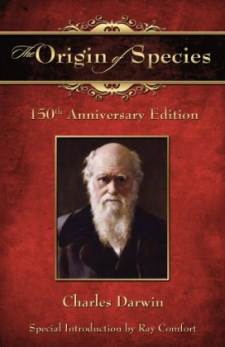
For the few of you who have been on board the International Space Station and haven’t yet heard the news, the 150th anniversary of Origin of Species came along last year and some Young Earthers saw a chance to leverage this into propaganda. Since the copyright is long expired, the text is in the public domain, and any Joe Blow is free to publish it. This particular Joe Blow came in the person of evangelist Ray Comfort, who vomited a “Special Introduction” intended to discredit evolutionary biology into the front of Origin. He then published it inside a cover giving every indication that it was a legitimate copy of the seminal work. Regardless of whether he admits it or not, the whole charade was a deliberate attempt to trick students into reading Ray’s own mental diarrhea instead of the book they thought they were buying, and hopefully win over a few converts.People said “Just rip out the introduction and presto, you’ve got a good book” or “It’s still OK because students are smart enough to ignore the graffiti in the front, and just read the intelligent part in the back.” Maybe, but if you’ve ever had your hands on a copy and actually cracked it open, you’ve seen that this is not such an attractive proposition.
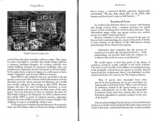
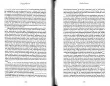
For, while the Ray Comfort pages are nicely typeset, well designed, and festooned with illustrations, spacing, bullet points, and indentation, the Charles Darwin part has been forced through some kind of Disneyland supershrink machine. It’s been compressed into a tiny, virtually unreadable font. All breaks have been removed. There is no whitespace at all, except for a double space and a centered title at each of the 14 included chapters (not even a page break!). I don’t consider my eyes to be the worst in the world, but I can’t read it. The font is so small over these long, unbroken lines that I lose my place every time I try to go to the next line. I’d need to use a straightedge to read it, seriously. I scanned a couple representative pages from each section. Click on them to see what I’m talking about. The scans are the same size as each other.
Was this done accidentally? Was it done to save money? Of course not. It was done to discourage readers from attempting to access the content they tried to purchase; to tie a gag around Darwin’s mouth while Comfort preaches away unrestrained. More than anything else, it reminds me of what TV networks do to the end credits of movies these days: The movie is squished into one side of the screen and made to scroll past at an accelerated rate, while the majority of the screen, and all the sound, are devoted to commercials for upcoming shows.
The content (and many other aspects) of Comfort’s “Special Introduction” have been thoroughly covered elsewhere, so I’m not going to repeat them here. But I do feel that this one seemingly insignificant tactic, often overlooked, speaks with a very loud voice.


I saw a kid in a bookstore a few weeks ago and he was looking at that book (unfortunately people seem to be buying it). I said it was no good and pointed out the legitimate copies on the shelf – both the original text and the last revision by Darwin were available. I suggested the original text rather than the later revision (since Darwin was nagged to make changes to accommodate a sky fairy and the language annoys the hell out of me even if it is only a phrase here and there; some points which were made well in the original had been watered down later on).
I’m a little perplexed by the labels on the images of the pages. Are they reversed?
I think they’re just referring to what section of the book is shown.
I was perplexed too, until I realized that although I read the words, “The Ray Comfort pages, and The Charles Darwin pages“, my brain parsed the information as The Ray Comfort version and The Charles Darwin version. See the difference there? Perhaps the same thing happened to you?
Yep. Exactly what happened. That’s what I get for reading it at 5:30am my time!
Ooooooh… I get it now. Took me a minute, though.
The many illustrations in the introduction are especially ironic given that Ray Comfort removed the single illustration in Origin of Species (the famous tree diagram).
Brian, you say it’s old news but you’ve timed your article to be just a week after the books were handed out on Australian campi.
I agree. I noticed the small font but didn’t think much of it, but you’re right, it’s clear that it was deliberate. I suppose it’s not often one publishes a book with an aim to have people not read it.
Does this anniversary addition come with Crocoduck cover?
Personally, I loved this version of the book. I’ve got it proudly displayed on the fireplace mantle next to The Holy Bible: Bullshit Edition, held up by some nifty Penn & Teller bookends.
Hmm. Thanks for this. I haven’t seen the book, but I’ve read both online, the original text and comfort’s. The main thing that struck me is the difference in style. it’s like night and day:
Darwin = well reasoned, organized, thoughtful, balanced,
Comfort = hysterical tone, jumps from topic to topic, no support for his claims, poorly reasoned.
Just the contrast with how BAD the detractors present their stuff would convince me to follow Darwin. Looks like this occurred to Ray & co too.
What i found most ironic was that Comfort once again picked up on a banana analogy, though he was quoting someone else this time. I think he’s got a problem with bananas that’s an indicator of deeper problems!
Sometimes a banana is just a banana…and sometimes it makes people uncomfortable to see one eaten.
Thou shalt not bear false witness?
Awesome Brian,
I think your analysis is very insightful.
I reached out to my college age children and colleagues at various universities around the north east and failed to get a Comfort edition. It appears that what you report is a testament to the threat of the word. I’ve read the entire text (1st Edition) in a very easy to read format and I found the task daunting – but WELL WORTH IT! Is it also true that Comfort left out a few chapters?
Dear Mr Dunning
Would it help at all if you knew that the Victorians had a something of a habit of publishing magazines (including journals) and books in what now appears to be an undersize font and without the various characteristics that we regard, in the 21st century, as necessary for a reasonable degree of readability – bullet points, short paragraphs, lots of whilte space, etc.?
Whatever the rights and wrongs of Mr Comfort’s ideas, he may just be reproducing Darwin’s text in an authentic facsimile of the original.
The filthy swine!